The family chapel exemplifies how architecture can be functional and transcendent at the same time
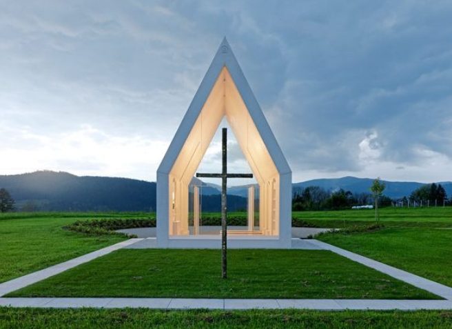
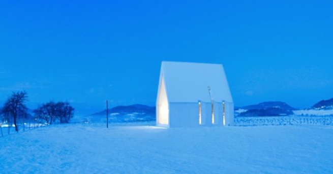
The chapel’s design is unmistakable, featuring a small size, a steep roof, a transparent structure, and a cross. Despite its simplicity, the architecture is anything but ordinary, evoking both excitement and contemplation. Perhaps this is because it eschews modernist tricks of self-expression. Its pure white form is visible from far away, standing out amidst the gently rolling landscape of vineyards. The slender and lofty roof imbues the structure with an unmistakable sacredness, leaving no doubt that it is a chapel.
The building’s proportions are harmoniously balanced, adhering to Leonardo da Vinci’s golden ratio. Its structure is stripped down to the essentials, with glass walls replacing the two front sides. In the axis of the building, a few meters in front of the Maria Magdalena family chapel in Zollfeld, Carinthia, stands a bronze cross crafted by the Czech artist Jaromír Gargulák. Only upon closer inspection does one notice the sculptural features of the building’s perfectly molded white concrete body. The side walls are punctuated with three window slits, each with a structural thickness of around 30 centimeters, while the 7.80-meter-high roof also has its own window opening.
Carinthian artist Karl-Heinz Simonitsch designed the glazing for the openings, depicting the story of creation. The bevels surrounding the openings are strategically designed to capture as much sunlight as possible, especially during the morning and evening. On the west side, facing the forecourt, a massive double-leaf gate made of hand-hammered bronze (also designed by Gargulák) is present. Although the rest of the building is clearly glazed, the gate can be opened wide to incorporate the forecourt, providing ample space for hosting large celebrations.
Nature flowing through space
The interior of the chapel features white walls that obscure much of the surrounding cultural landscape, while the narrow glazed sides provide a serene view of the undeveloped natural scenery. The horizon is dominated by the Magdalensberg pilgrimage church. One feels as if the landscape is flowing through the space, creating a sense of connection with infinity. The chapel provides a rare opportunity for contemplation, meditation, and reflection, which is not often found in modern religious structures.
The interior design of the chapel is intentionally simple and minimalist. The white walls blend seamlessly into the light, travertine-colored stone floor. With a knowledge of history, one can recognize this as a reference to the stone used for the columns in St. Peter’s Square in Rome. The overall effect is one of warmth and tranquility. A single step in the nave leads to the choir, where rectangular niches are set into the walls. On the right is a larger niche that serves as a stand for the statue of Mary Magdalene, while twelve smaller urn niches are located on the left. The seating is provided by whitewashed oak benches that can be folded down and disappear flush into the concrete surfaces of the left-side wall.
Design language and soft concrete
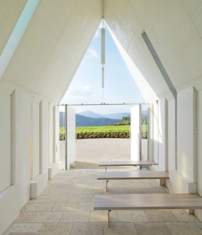
As an architecture enthusiast, it is impossible to ignore the striking presence of this chapel. The design language is clear, simple, and devoid of any unnecessary embellishments. The impeccable craftsmanship is also worthy of praise. Self-compacting concrete (SCC concrete) was used, which has a considerably softer consistency than conventional vibrated concrete. It deaerates automatically through gravity and has excellent flow properties. A complex steel girder construction allowed for the formation of the formwork, resulting in a seamless, continuous, white concrete structure without any formwork anchors. Its radiant white color stands out in the landscape, drawing in passersby with its captivating presence.

